The Rise and Fall of BuzzBlaze
A little over a year ago, I launched my first ever startup – BuzzBlaze. It was a social news aggregation website that helped people discover and share content online. The project started out of boredom with my high school friend Tony Chen. I had just gotten accepted into Stanford and needed something productive to do for my last summer before college.
I’ve always been interested in tech startups but never actually got around doing one. I had the domain name BuzzBlaze.com sitting in my account and decided this was my chance. We came up with the idea to build a better RSS reader.
Six months later, we launched and BuzzBlaze took off like crazy. One week later… it died. A few weeks later, we shut down BuzzBlaze. Since then, many of the features and visions we had for BuzzBlaze became reality, with the rise of Pulse, Flipboard and Washington Post’s Social Reader.
BuzzBlaze was a failure. We made every single mistake in the book. As I’m working on my current projects, I always reflect on BuzzBlaze and try to learn from the mistakes. Hopefully, you’ll find my experience with BuzzBlaze insightful too.
With this in mind, here’s the story behind the rise and fall of BuzzBlaze:
The Idea
BuzzBlaze is essentially an RSS reader on steroids. The idea was stemmed out of this quote I came across:
“Our ability to create information has far exceeded our ability to manage it.”
It occurred to me that the problem of information overload was becoming increasingly difficult to solve. As a media junkie (having just sold an online magazine few months prior), I immediately thought of content consumption – why not create a service that would allow people to manage the information that they are exposed to through news and blogs in an organized, efficient and relevant way?
We found our pain point and decided to set off with the goal of changing the way people read news online. The solution we came up with was a social news application where you could follow your friends to see what they are reading and have their recommendations pushed to you. To put it bluntly, it was a fancy RSS reader with a social layer built on top.
Then came the hard part – differentiating ourselves from the competition. Keep in mind that we were doing all of this in the pre-Pulse/Flipboard era. We looked through the existing solutions out there:
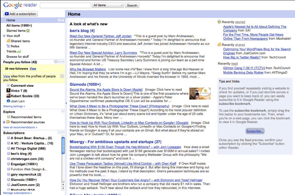
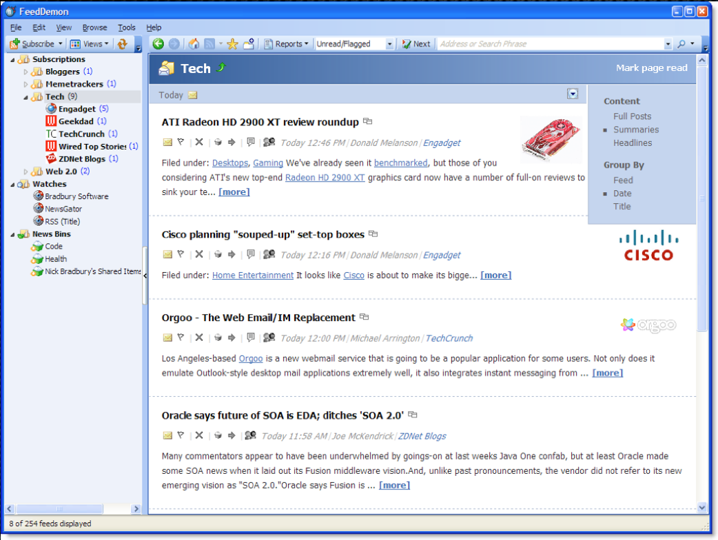
We quickly realized a commonality – all the RSS readers out there were ugly. Even though RSS has been around for years, it’s by no means a consumer-friendly technology. Since both Tony and I both have strong design backgrounds, we wanted to make RSS readers beautiful. The experience of reading news online should be like browsing a magazine.
And that’s how BuzzBlaze was born.
Building The Website
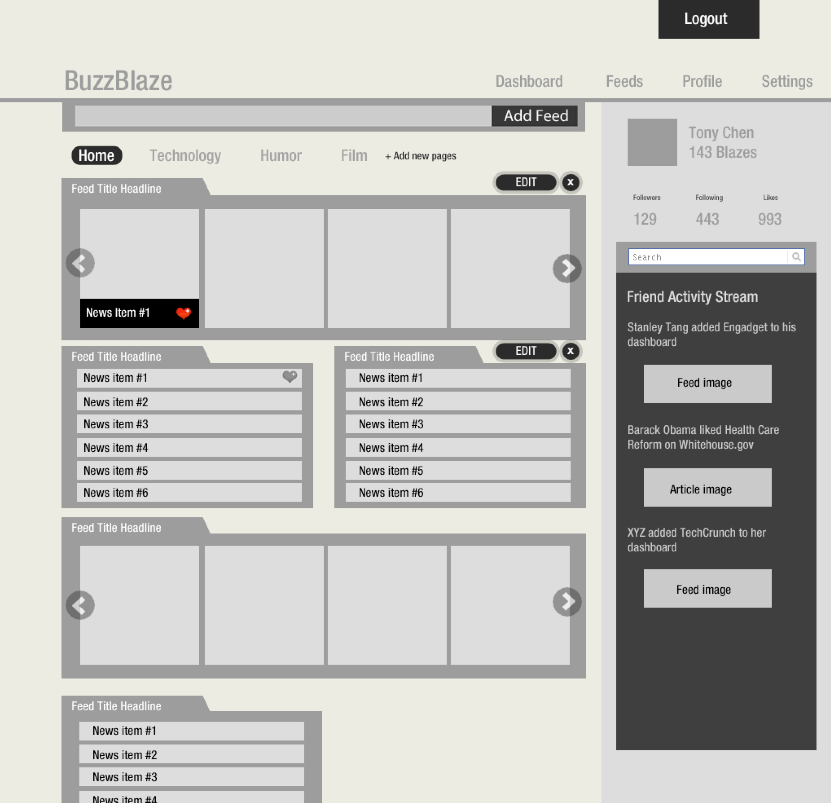
We were both pretty comfortable with photoshop and HTML/CSS and quickly threw together a mockup in a few days, which laid out the dashboard drag-and-drop interace, widget panels and friend activity stream:
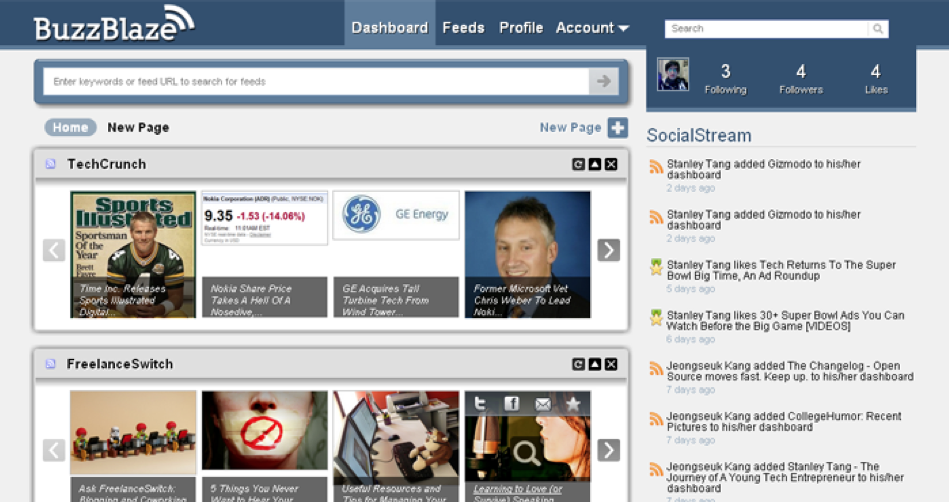
Six months later, we turned our mockups into real products:
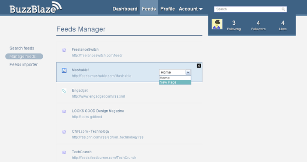
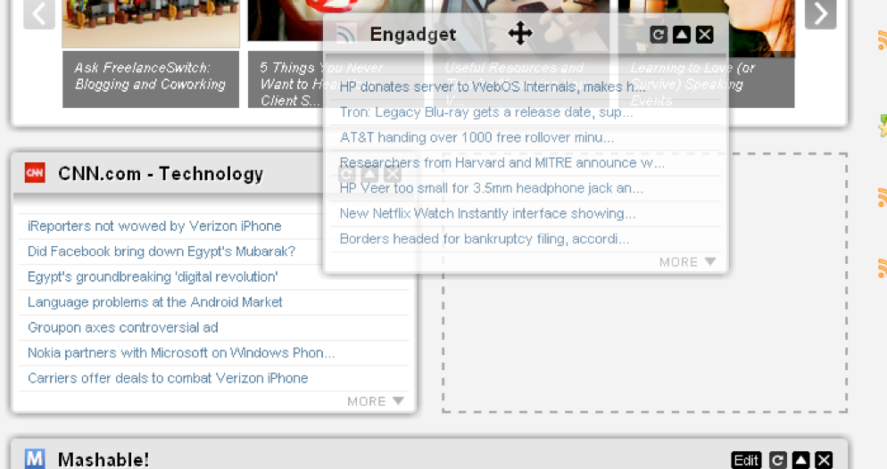
Since Tony and I were both front-end developers, we had zero clue about building a large-scale web application. So we just picked PHP as our development language – I have no idea why we didn’t pick something like Ruby (Rails) or Python (Django). We had to hire a third developer to help us build the backend systems. This decision later came back to haunt us…
Launch
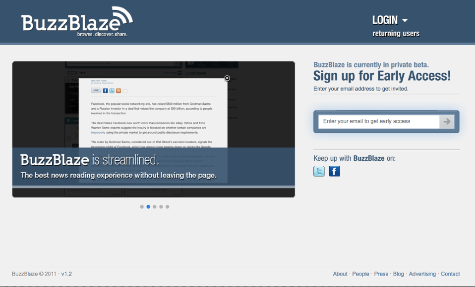
Our marketing strategy was pretty simple – create a private beta landing page and promote the heck out of it. Having done internet marketing for the past five years, I was pretty confident with our campaign strategy. We used MailChimp to capture the email addresses and ended up with a prelaunch list of around 2000 subscribers.
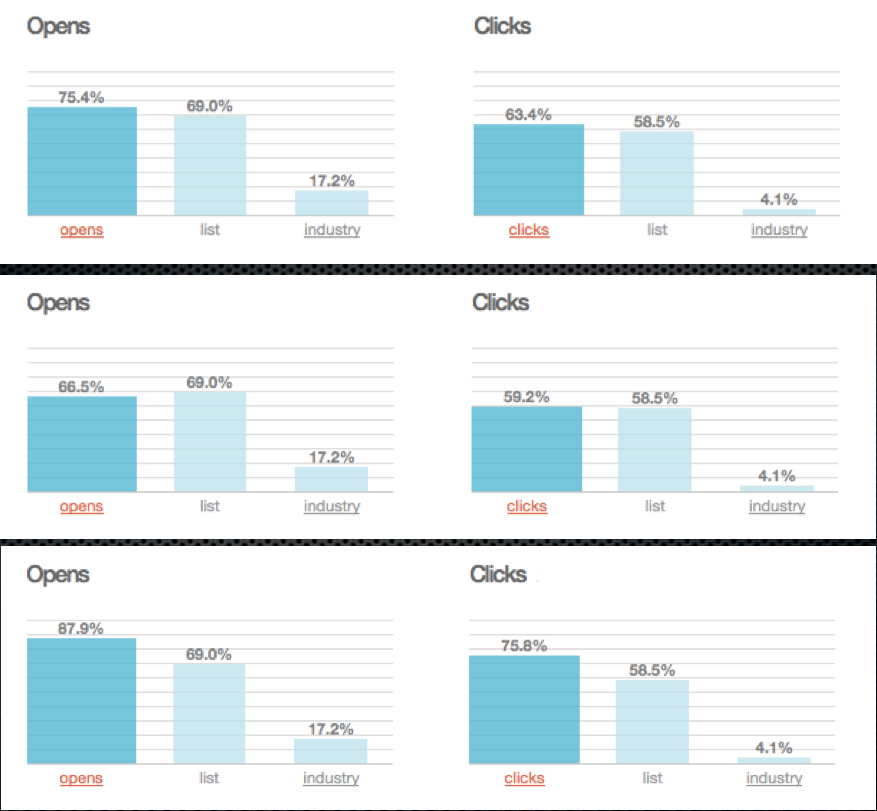
Those weren’t just random 2000 subscribers – they were targeted and super active. In fact, on launch week, we sent out three different emails. When we opened the stats, we couldn’t believe our eyes – our clickthrough rates were 15-18x the industry average!
On launch day, we got ourselves in tons of media outlets, including TheNextWeb, YoungEntrepreneur, FastGush and much more…
All this resulted in over 500 active users in the first 48 hours of launch. In fact, one of our test users was Mark Cuban! As far as our marketing went, we went flawlessly and couldn’t have done any better.
Crash And Burn
But, our traffic quickly spiraled down and three weeks later, we had zero active users – most just logged in once and never came back. Two months later, we shut BuzzBlaze down and moved on.
There were several valuable lessons we took away from the experience:
Lesson #1: Hype Only gets You So Far
We had an awesome marketing campaign. We got on tons of media outlets. However, our product didn’t live up to the hype. Truth be said, BuzzBlaze was a pretty lousy product – we should have realized when we didn’t even used BuzzBlaze ourselves. It turns out we didn’t build something people actually wanted. We never researched the market and didn’t understand people’s needs.
When people sent in feedbacks during the private beta phase, we never iterated on them and shipped out updates – partly because we had no freakin’ clue how to code a lot of the features. Hype only gets you so far. Your product needs to live up to it.
Lesson #2: Poor User Experience
There’s much more to building a great product than making it look beautiful. BuzzBlaze looked slick, however, it did not feel slick. The website was far too slow and the feed search was confusing to use.
When people first signed up, they were presented with a blank screen. It was way too slow for people to add feeds to the dashboard – what we should have done was suggest existing feeds to add and pre-populate people’s dashboards with categories they can select.
Another issue was that we built an email confirmation system when users signed up. However, for some reason all of our emails went to spam, so a lot of people just signed up but never activated their account. It turns out email deliverability is a pretty complicated thing in itself, with weird stuff like SMTP, email headers etc. We had no freakin clue what SMTP was before that point.
Design isn’t just about having a great user interface, it also entails user experience (especially during the sign up process) – we confused the two.
Lesson #3: News Has Gone Mobile
This goes back to our first point – we didn’t research well enough. We failed to realize the current state of the journalism industry and the trend of news going mobile. By the time we have launched BuzzBlaze, apps like Flipboard and Pulse have already gained significant traction. It was too late for us to pivot. We focused on web when we should have focused on mobile.
Lesson #4: Waiting Too Long To Launch
We came up with the idea around May/June 2010. We started developing around July. We had a target launch date of September. We ended up launching in February 2011. Six months was way too long to get our product out the door.
One of the biggest reason was that we were simply not technical enough – we didn’t know anything about the backend and relied heavily on our third party developer. Whenever we wanted something done, it will take around two days for the developer to reply. And maybe another two days to explain it. By the time he actually understood the feature, a week has gone by. The turnaround time was way to slow. It didn’t help that in September, I headed off to Stanford while Tony was back in Hong Kong.
Furthermore, the fact that we didn’t know too much about the backend meant it was completely reliant on blind trust. The site turned out to be very sluggish. Looking back at the code (know that I’m pretty technical), it was pretty crappy.
We also tried to do way too much for version 1.0. We basically tried to pack every single feature we could think of into the product, as opposed to focusing on building an MVP (minimum viable product) to test out our hypothesis. As time went on, we added more and more features, which dragged the launch date further and further back.
Ultimately, for BuzzBlaze, we failed to look at the big picture.
What’s Next
BuzzBlaze was a great experience for both Tony and I. It was just the fact that we got to be part of the startup culture. A large part of being an entrepreneur is about building stuff – and building stuff fast.
While BuzzBlaze was a failure, I’ve definitely learnt a lot of the lessons. Even just building it helped me understand how web applications work (frontend, backend, integrations etc). I learned more HTML/CSS/Javascript than I ever would I have learned from a textbook. The key is to fail fast and move on.
It’s great to see apps like Pulse and Flipboard taking off. We knew we were onto something with our idea, but at the end of the day, it’s really about the execution.


It was a Great experience Stanley.
I guess this is some kind of a “FACEMASH” in your life.
Who knows you might be creating the next big thing in near future 🙂
You have said it all stanley “The key is to fail fast and move on.” I’m inspired by your post. »?-?? †?ånKz-?